
V ére poháňanej technológiami je webová stránka často prvým miestom, kde zákazníci prichádzajú do styku so značkou. Je to vaša digitálna vizitka, informačné centrum a tiež nástroj na prilákanie nových klientov. Preto je nevyhnutné mať dobre navrhnutý a funkčný web.
Návrh stránky si však vyžaduje istú tvorivú disciplínu. Každý prvok, vizuál, obsah, používateľské rozhranie a navigácia musia spolupracovať, aby sa vytvorila rovnováha, ktorá bude pre vašu stránku fungovať. Nie je to najjednoduchšie, ale preto sme si pre vás pripravili niekoľko cenných tipov na vytvorenie kvalitnej webovej stránky.
1. Účel
Aké posolstvo nesie vaša webka? Aká výzva k akcii bude jej ťažiskom?
Účel webu nemusí byť zložitý. Môže ísť o propagáciu produktov a služieb, rozprávanie príbehu spoločnosti, učenie návštevníkov či milión iných možností. Vytvorte si krátke a výstižné poslanie, ktoré sa zhoduje s hodnotami toho, čo chcete prezentovať.
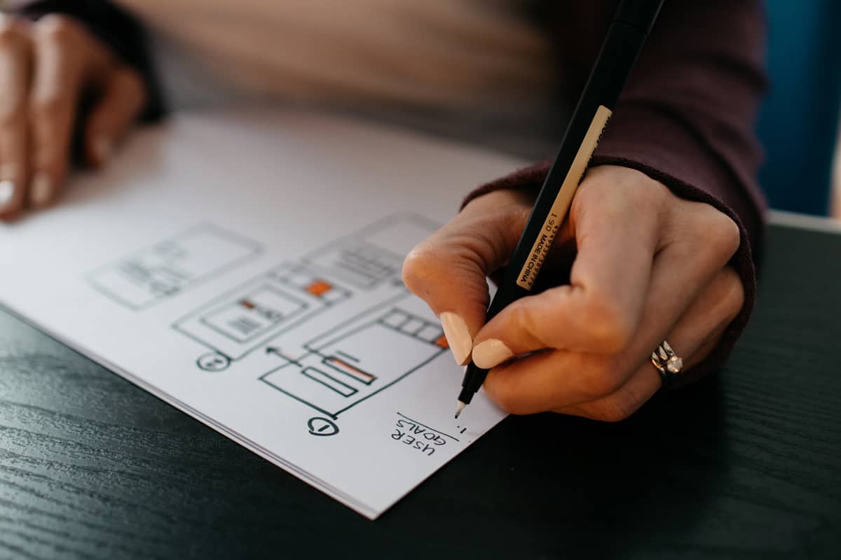
Komunikácia účelu tiež pomôže usmerniť webových dizajnérov pri procese návrhu webu. Nech už sa rozhodnete akokoľvek, mali by ste sa do toho pustiť s plánom, pretože webový dizajn nie je jednou z tých vecí, ktoré necháte na náhodu.
Keď premýšľate o účele svojho webu, majte v prvom rade na pamäti potreby používateľov webu – kto bude navštevovať vašu stránku? Prečo ju budú navštevovať? Ako im vaša stránka poskytne to, čo potrebujú? Poznanie vášho publika je kľúčovým krokom pri hľadaní smeru, ktorým by ste sa mali uberať.
2. Obsah a SEO
V tomto bode procesu tvorby stránky majte na pamäti tieto jednoduché pravidlá: obsah by mal byť užitočný, jasný a mal by viesť vaše publikum k dokončeniu požadovanej akcie.
Ďalším dôležitým faktorom je SEO (Search Engine Optimization). Malo by byť plynulo a premyslene integrované do vášho obsahu či začleňovať relevantné kľúčové slová, ktoré hľadáte, ale v konverzačnom tóne, ktorý neodvádza pozornosť od vášho pôvodného posolstva.
3. Vizuálna príťažlivosť
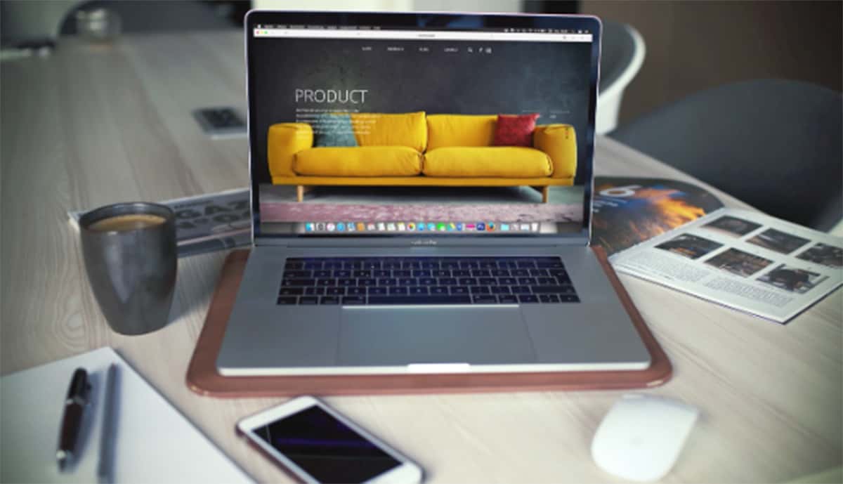
Komunikovanie identity vašej značky by malo byť na prvom mieste zoznamu pri plánovaní dizajnu webu. Grafika, fotografie a ilustrácie pomáhajú vyvážiť text a rozčleniť stránku, aby bola pre diváka ľahšie stráviteľná.
Premýšľajte v zmysle vizuálnej hierarchie. Váš prvý obrázok/grafika/dizajn by mal diváka upútať tým, že mu ukáže niečo, čo zaujme ihneď. Môže to znieť ako klišé, no prvý dojem je najdôležitejší.
Vysokokvalitné obrázky v dobrom rozlíšení, farebne vyvážené fotografie a vkusné grafiky sú kľúčom k esteticky príťažlivému webu. Ak nie je upútaná pozornosť návštevníka stránky cez najsilnejší zmysel – zrak, neohreje sa na webe dlho. Dĺžka pobytu na webovej lokalite je niečo, na čo sa Google pri hodnotení vašej lokality pozerá.
Avšak, niekedy platí pravidlo „menej je viac" – nerušte používateľov zážitok z používania príliš veľkým tlačidlom alebo kontrastnou farbou, ak to nie je atmosféra vašej stránky.
Farebná paleta môže nastaviť komplexnú náladu stránky. Farebné tóny majú veľký vplyv na prezentáciu vašej značky svetu, preto sa rozhodujte uvážene.

4. Prehľadnosť
Biely priestor a dizajnové prvky sú pri webovom dizajne dôležité, pretože pomáhajú vyniknúť obrázkom a textu a zabraňujú tomu, aby vaše stránka vyzerala príliš preplnene.
Pre transparentný web je dôležité isté logické usporiadanie. Mal by prirodzene plynúť, aby viedol vašich návštevníkov k cieľu, ktorý máte v úmysle.
Celý obsah vašej webovej lokality by mal byť ľahko navigovateľný v niekoľkých krokoch. Aj keď nechcete, aby vám unikol žiaden bod, chcete sa vyhnúť aj príliš veľkému množstvu tlačidiel, rozbaľovacích okien a interných odkazov. Zachovajte jednoduchosť a logickosť.
Predstavte si, že prídete na križovatku, z ktorej vedie niekoľko rôznych ulíc všetkými možnými smermi. Chvíľu potrvá, kým sa zorientujete, ktorým smerom sa vybrať, všakže? Takisto funguje aj webová stránka, na ktorej sú všade odkazy a možnosti.
5. Typografia
Tvar a štýl písmen dáva stránke väčší význam, než si myslíme. Podľa písma môžete zistiť, aká je zvyčajne celková atmosféra či téma knihy.
Písmo tak môže zosobniť tón vášho hlasu. Myslite na to, že text je to, čo hovoríte, a písmo je to, ako to hovoríte.
Pre veľké bloky informácií bude s veľkou pravdepodobnosťou najlepšou voľbou tradičné písmo, zatiaľ čo štýlovejšie písma môžu byť vyhradené na podčiarknutie rôznych kľúčových informácií.
Rada na záver – buďte autentickí
Spotrebitelia sa nedajú ľahko oklamať. Chcú sa naozaj cítiť prepojení so značkami, ktoré podporujú. Aj keď je estetika dôležitá, autenticita ešte viac.
Len preto, že to fungovalo konkurencii neznamená, že to bude fungovať aj vám. Choďte do toho, čo vychádza z vašej esencie a hodnôt. Ak si chcete vytvoriť lojálnych zákazníkov, musíte byť sami sebou a poskytovať informácie, ktoré sú pre vaše publikum hodnotné.
Ak by ste na celý proces nechceli byť sami a hodila by sa vám odborná ruka, sme tu pre vás.